Veerle Pieters, she is a graphic/web designer based in Deinze, Belgium. Starting in '92 as a freelance graphic designer, Veerle worked on print design before focussing more on webdesign and GUI (since '96). She runs her own design studio Duoh! together with Geert Leyseele. Veerle has been blogging since 2003 and is considered number 39 on the list of "NxE's Fifty Most Influential 'Female' Bloggers". Her blog:http://veerle.duoh.com/.Twitter to follow Veerle Pieters (@vpieters)
I received her email later than the PP2 submission, and couldn't put it into my Live network list. But her advices about the user interface design is really helpful, so I just wanna show it on my blog.
She had a quick look at my web site. There is a lot of things that could use some fixing. For example there isn't a lot of breathing space between the text and pictures. My visited links are a bit dark so her don't read it very well anymore. The dates are in a weird position too. The rusty color I use to explain the screenshots is totally unreadable. She would recommend that my browse around some quality web site galleries such ashttp://www.cssbeauty.com/ for example and study how they apply colors and lay-out.
For the rest she would recommend reading some of these books to get a better understanding about web design. The lists of the books show in the image below.
Let’s be honest. Being a web developer or a web designer doesn’t exactly give you an edge with the pretty girls (or guys) at your local pickup bar. If you were a part-time firefighter or investment banker, maybe. Nevertheless, the feud continues between web designers and web developers over which profession is the true calling. Like the yin and yang, these two are in constant battle to prove their dominance over the other, even when they work closely together.
Here is an infographic of the differences between web designers and web developers.
Infographic by: Shane Snow. Shane Snow is an entrepreneur, writer, and recent Columbia MS/Digital Media graduate. Visit hispersonal siteand follow him on Twitter @shanesnow.
As learning from the O'Reilly mentioned in an earlier post on his Webcast 'Designing Web Interfaces', I understand designers don't want to limit blog to just the principles and patterns found in the book. For that, as he said, you can check out his design onExplore the Booksection.In the spirit of that, I want to share an additional set of principles and patterns I have been using for my RVJ.
This is the first article in a three part series.
Standard Screen Patterns: 12 patterns w/100 examples
Master/Detail screen pattern can be vertical or horizontal. Ideal for creating an efficient user experience by allowing the user to stay in the same screen while navigating between items. Horizontal layout is a good choice when the user needs to see more information in the master list than just a few identifiers- or when the master view is comprised of a set of items that each have additional details.Click on thumbnail for larger image ORdownload the PDF.
02. Column Browse
The Browse screen pattern can be vertical or horizontal. Ideal for creating an custom user experience by allowing the user to start from various entry points for navigating to the item(s) they are interested in.
03. Search/ Results
The Search screen pattern can range from very simple to quite advanced. Ideal for creating an efficient user experience by allowing the user to navigate directly to an item or set of items meeting specific criteria.
04. Filter Dataset
The Filter Dataset screen pattern can be vertical or horizontal. Ideal for creating an efficient user experience by allowing the user to refine a set of known data, or further refine search results.
The Palette/ Canvas screen pattern is seldom the right pattern to apply, but it is the only pattern for documenting or creating: linear or non-liner processes; flow diagrams; screen layouts; design/diagram with physical size or layout constraints.
07. Dashboard
A well designed Dashboard will provide: key information at a glance, real time data, easy to read graphics, clear entry points for exploration This is typically not achieved by displaying a single screen of metrics (either in a big table, or just a bunch of graphs). Providing a high degree of customization is no substitute for user research and testing. Stephen Few has a nice book on this topicInformation Dashboard Design: The Effective Visual Communication of Data.
08. Spreadsheet
The Spreadsheet screen pattern is ideal for creating an efficient user experience by allowing the user to easily scan, edit and enter information (in bulk). The Spreadsheet should provide the following functionality: standard table features like sort, hide/show columns, rearrange columns, group by (if applicable), global level undo/redo, add/insert/delete row, keyboard navigation, import and export.
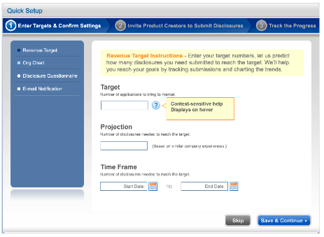
09. Wizard
The Wizard/Quick Start screen pattern is ideal for creating an efficient user experience by guiding the user through a complex or infrequent workflow.
For examples,
10. Interactive Model
The Interactive Model screen pattern is characterized by many interactive elements associated with the key object (a calendar, map, graph, chart, canvas). It is ideal for creating a user experience that is closely aligned with the user’s mental model (a natural fit). Excellent candidates for this pattern are: calendars, maps, gantt charts, what-if scenarios (including calculators), WYSIWYG editors (including photo editing).