Showing posts with label website presence elements. Show all posts

5.09.2012

I got response from Veerle Pieters


Veerle Pieters, she is a graphic/web designer based in DeinzeBelgium. Starting in '92 as a freelance graphic designer, Veerle worked on print design before focussing more on webdesign and GUI (since '96). She runs her own design studio Duoh! together with Geert Leyseele. Veerle has been blogging since 2003 and is considered number 39 on the list of "NxE's Fifty Most Influential 'Female' Bloggers". Her blog: http://veerle.duoh.com/.Twitter to follow Veerle Pieters (@vpieters)


I received her email later than the PP2 submission, and couldn't put it into my Live network list. But her advices about the user interface design is really helpful, so I just wanna show it on my blog.


She had a quick look at my web site. There is a lot of things that could use some fixing. For example there isn't a lot of breathing space between the text and pictures. My visited links are a bit dark so her don't read it very well anymore. The dates are in a weird position too. The rusty color I use to explain the screenshots is totally unreadable. She would recommend that my browse around some quality web site galleries such as http://www.cssbeauty.com/ for example and study how they apply colors and lay-out.
For the rest she would recommend reading some of these books to get a better understanding about web design. The lists of the books show in the image below.

5.06.2012

Web Designers vs. Web Developers (Infographic)

Let’s be honest. Being a web developer or a web designer doesn’t exactly give you an edge with the pretty girls (or guys) at your local pickup bar. If you were a part-time firefighter or investment banker, maybe. Nevertheless, the feud continues between web designers and web developers over which profession is the true calling. Like the yin and yang, these two are in constant battle to prove their dominance over the other, even when they work closely together.
Here is an infographic of the differences between web designers and web developers.
Infographic by: Shane Snow. Shane Snow is an entrepreneur, writer, and recent Columbia MS/Digital Media graduate. Visit his personal site and follow him on Twitter @shanesnow.

5.03.2012

Designing Web Interfaces

 Principles and Patterns for RICH Interaction


-O'Reilly Webcast: Designing Web Interfaces

10 Standard Screen Patterns
As learning from the O'Reilly mentioned in an earlier post on his Webcast 'Designing Web Interfaces', I understand designers don't want to limit blog to just the principles and patterns found in the book. For that, as he said,  you can check out his design on Explore the Book section. In the spirit of that, I want to share an additional set of principles and patterns I have been using for my RVJ.


This is the first article in a three part series.
  1. Standard Screen Patterns: 12 patterns w/100 examples
  2. Essential Controls: 30 controls for RIA design and development
  3. Components for Commonly Requested Features: 15 patterns and examples


01. Master/Detail

Master/Detail screen pattern can be vertical or horizontal. Ideal for creating an efficient user experience by allowing the user to stay in the same screen while navigating between items. Horizontal layout is a good choice when the user needs to see more information in the master list than just a few identifiers- or when the master view is comprised of a set of items that each have additional details. Click on thumbnail for larger image OR download the PDF.

02. Column Browse


The Browse screen pattern can be vertical or horizontal. Ideal for creating an custom user experience by allowing the user to start from various entry points for navigating to the item(s) they are interested in.

03. Search/ Results

The Search screen pattern can range from very simple to quite advanced. Ideal for creating an efficient user experience by allowing the user to navigate directly to an item or set of items meeting specific criteria.

04. Filter Dataset


The Filter Dataset screen pattern can be vertical or horizontal. Ideal for creating an efficient user experience by allowing the user to refine a set of known data, or further refine search results.

For example,


05. Forms


All Form screens should be approached with a solid understanding of usability and design best practices. Refer to “Web Form Design: Filling in the Blanks” by Luke Wroblewski for reference.
For examples,


06. Palette/ Canvas

The Palette/ Canvas screen pattern is seldom the right pattern to apply, but it is the only pattern for documenting or creating: linear or non-liner processes; flow diagrams; screen layouts; design/diagram with physical size or layout constraints.

07. Dashboard

A well designed Dashboard will provide: key information at a glance, real time data, easy to read graphics, clear entry points for exploration This is typically not achieved by displaying a single screen of metrics (either in a big table, or just a bunch of graphs). Providing a high degree of customization is no substitute for user research and testing. Stephen Few has a nice book on this topic Information Dashboard Design: The Effective Visual Communication of Data .


08. Spreadsheet


The Spreadsheet screen pattern is ideal for creating an efficient user experience by allowing the user to easily scan, edit and enter information (in bulk). The Spreadsheet should provide the following functionality: standard table features like sort, hide/show columns, rearrange columns, group by (if applicable), global level undo/redo, add/insert/delete row, keyboard navigation, import and export.

09. Wizard

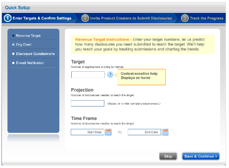
The Wizard/Quick Start screen pattern is ideal for creating an efficient user experience by guiding the user through a complex or infrequent workflow.
For examples,


10. Interactive Model


 The Interactive Model screen pattern is characterized by many interactive elements associated with the key object (a calendar, map, graph, chart, canvas). It is ideal for creating a user experience that is closely aligned with the user’s mental model (a natural fit). Excellent candidates for this pattern are: calendars, maps, gantt charts, what-if scenarios (including calculators), WYSIWYG editors (including photo editing).


4.30.2012

A Comprehensive Website Planning Guide


This guide is written in relatively non-technical language and provides a broad overview of the process of developing a website, from the initial needs assessment through the launch, maintenance and follow-up. It is appropriate for:
  • Small and medium-sized businesses;
  • Organizations;
  • Institutions;
  • Web designers, developers, and design and development firms.
If you’re building a four-page website for your family reunion or a 5000-page website for a Fortune 500 company, then this guide might not be for you; it will either be too detailed or way too short, respectively.

                                    Important questions and answers. Image by opensourceway


COMMON RESULTS OF FAILING TO PLAN
  • The designer or developer is forced to make assumptions, which may or may not be correct, about how certain content will appear on the website.
  • The amount of back-and-forth communication about trivial matters can be multiplied many times over.
  • Backtracking causes delays and missed deadlines.
  • Work that falls outside the original scope of the project creates cost overruns.
  • Confusion and client dissatisfaction are byproducts of a shoot-from-the-hip process.

Determine Website Content

WHO’S RESPONSIBLE?

As you prepare to add content to the website, think about who will contribute. In a five-person business, it might be just two of you, and that’s fine. In a large business or organization, 5, 10 or 15 people might be contributing content. The time required to edit and proofread both copy and visual content grows exponentially in proportion to the number of people who contribute content.
                      Clear the fronts and distribute clear responsibilities. Image by opensourceway


CONTENT IS NOT JUST TEXT

Unless you are creating the dullest, most technical website imaginable, your content should consist of more than just plain text. By using one or more of the following multimedia elements, you’ll greatly enhance the appeal and usefulness of the website:
  • Images;
  • Documents (usually PDFs);
  • Audio;
  • Video (i.e., embedded from YouTube or Vimeo, or self-hosted);
  • Adobe Flash files;
  • Content feeds (from other websites, for example);
  • Photos (from Flickr perhaps);
  • Twitter stream;
  • Facebook “friends” list;
  • RSS feeds.

4.11.2012

How to reach the right audiences?


How to reach the right audiences, Focus your website content to the right direction

When you create a website, you're trying to make several different audiences happy. You've got searchers coming in from the search engines, you want those search engines to rank you well, and you've got past and prospective clients. Referral partners are also out there looking at your site and sending business your way. Each different audience for your website has its own requirements, different things it's looking for, and unique needs.
You have to think about each audience you're trying to appeal to as you design and develop the different parts of your site. That includes navigation style, types of pages, text on those pages, design, coding, offers, and calls to action. You have to make sure that each of these elements balances all the others so that there aren't too many pages with not enough content, or that navigation is so complex that it's hard for people to find what they're looking for.

It's easy to focus on one audience's needs over another.

Getting stuck thinking about one element of your site can result in an unbalanced site. And as you try to make your website do more, as you add complexity, it's harder and harder to keep the functions at equilibrium. The more elements your site contains and the more audiences you think about, the more difficult it becomes to keep everyone happy.

Focus on balancing everyone's needs and concerns.

If you focus on one of your audiences over the others, you'll wind up with a website that seems out of balance and doesn't meet some of your audiences' needs. For example, you can focus too heavily on writing your site content to appeal to the search engines and create a site that's so keyword-laden you look a bit crazy.
Instead, try to keep all of your audiences' needs in harmony so that everyone has a good experience and is impressed by your site instead of wondering what's wrong with it.

When you write, design, and code your site, think about:

  • Who is visiting it? Where are your clients coming from? Search engines bring searchers to your site. Past clients look you up for new projects or needs. There are potential customers who have been referred to you. And those who have met you at networking events or seen your booth at a trade show. Each of these audiences has different levels of knowledge about you and different issues that they want to address.
  • What do they want to know? Each audience has different needs, problems, and concerns. The search engines want to know what your site's all about, and they want to see your keywords. Past clients want contact information and to see if you can help them with their new need. Potential clients want to know if you can solve their problem, and they want to know if you're trustworthy and likeable. People who have already met you want to get more information on your services and find out what's next in the process of working with you. Think about why people are coming to your site and how you can help them along.
  • What you want your website to do for your business? Your website should be more than just pretty. It should do a job (or several jobs) for your business. Think about how it can most benefit your business whether by bringing in new clients, getting noticed by the search engines, sharing your thoughts with the world through articles, helping you get the media's attention, or maybe some other function entirely. Whatever job your website must do, make sure that everything you put on it works towards making that happen.
  • Are you being accidentally contrary? Do any of the things you've put on your site for one audience contradict what you've written for another? You want to make sure that your site always makes sense, no matter who's reading it or how much of the site they read. You also want your site to mesh with your printed marketing pieces, phone conversations, and the delivery of your products or services to ensure that your customers stay happy.